

6 // Checking out Some Competitors
Thunk and Supernotes

Today I’ll do this a little different. I want to use this issue to write a bit about two competitors of Formable. For two reasons:
Most of you don’t really know what Formable will do. Saying it’s a tool for thought sparks interest in some, but most would still have no idea. So being more familiar with apps solving similar problems might help you get a feel for it.
For those who are a bit more into tools for thought / personal knowledge management, this overview should hopefully be even more interesting.I discovered both these apps on Twitter this week and want to check them out myself.
I actually have dozens such apps I still want to check out, to see if I can get any inspiration from them, but actually I have way more ideas than time to build anyway, so even though competitor research might help me build the right thing, I mainly do it for fun.
Don’t take my first looks of these as a review. I’m just writing down my thoughts while first trying them out. I didn’t even read or edit this text before sending it off.
Thunk

Like with my 2016 Votre, I see great use in Formable for daily and interstitial journaling. Also, their landing page and UI design look pretty sleek.
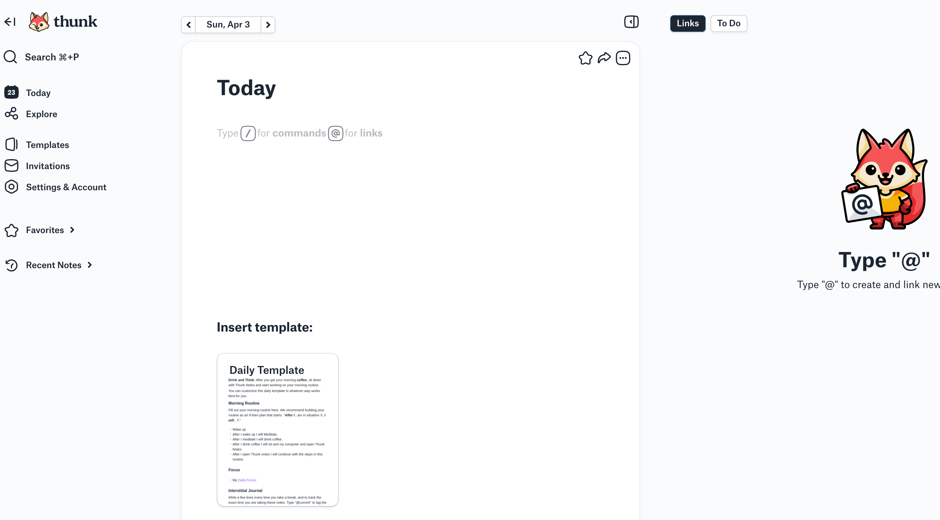
After signing up for a 30 day trial one lands on the writing / Today page. imo it’s pretty clear what to to here. Onboarding wise I wasn’t sure whether to start with just writing something, inserting a template, or playing with the @-linking feature mentioned on the right.
The pre done templates are pretty opinionated, but a nice way to onboard users. Instead of having people figure out how to make use of this tool’s features completely on their own, the app includes some workflows.
I plan to do something similar with Formable. Eventually its core might be feature-less (heard about this term here on Twitter). But in the beginning there won’t be any marketplace for apps on Formable, so it should also feel like it’s made for certain use cases.

This is just so much fun and so easy to use. I aspire to get to an equally nice UX with Formable.

Still have a far way to go with Formable lol
Another thing I like about Thunk is that they just use @ for linking a new note. I think that’s way more accessible than the [[ ]] some other tools use.
Ok, Thunk supports both. I guess I might have to do the same with Formable. It’s a standard by now, isn’t it?

Just having your cursor at a linked note will open it in the side panel. Nice.

Thunk doesn’t really excel at handling todos though. Like other parts of the app, you could call this minimal tooling opinionated. For me this wouldn’t be enough to handle my work. Tasks need just as much linking as notes.
Would be nice to see more fully fledged project management solutions here in the future, instead of just checklists.

This is the data export. I don’t think you could do anything with it without writing code to parse it. Looks like they use the same editor (Slate) as Formable does.
They have many super neat features. For solo note taking it’s at least worth a try.
Supernotes
Supernotes also comes with a very playful design and a pretty rounded font. I guess I’m a sucker for that.

I think one very interesting feature they have is how they handle permissions. Not many note taking tools make sharing easy. This looks intriguing. Not easy to do with a graph data structure.
I won’t test it further for now. Thankfully they have a nice help center. Here’s the article for that feature.
Generally, Supernotes feels a bit more overwhelming. Compared to Thunk I feel like I have to understand way more parts of the app before I’m comfortable with starting to write. I don’t immediately know how I’m supposed to structure my thoughts here. I guess the idea is to just drop info and do the organising (doing British spelling just for them here) later.
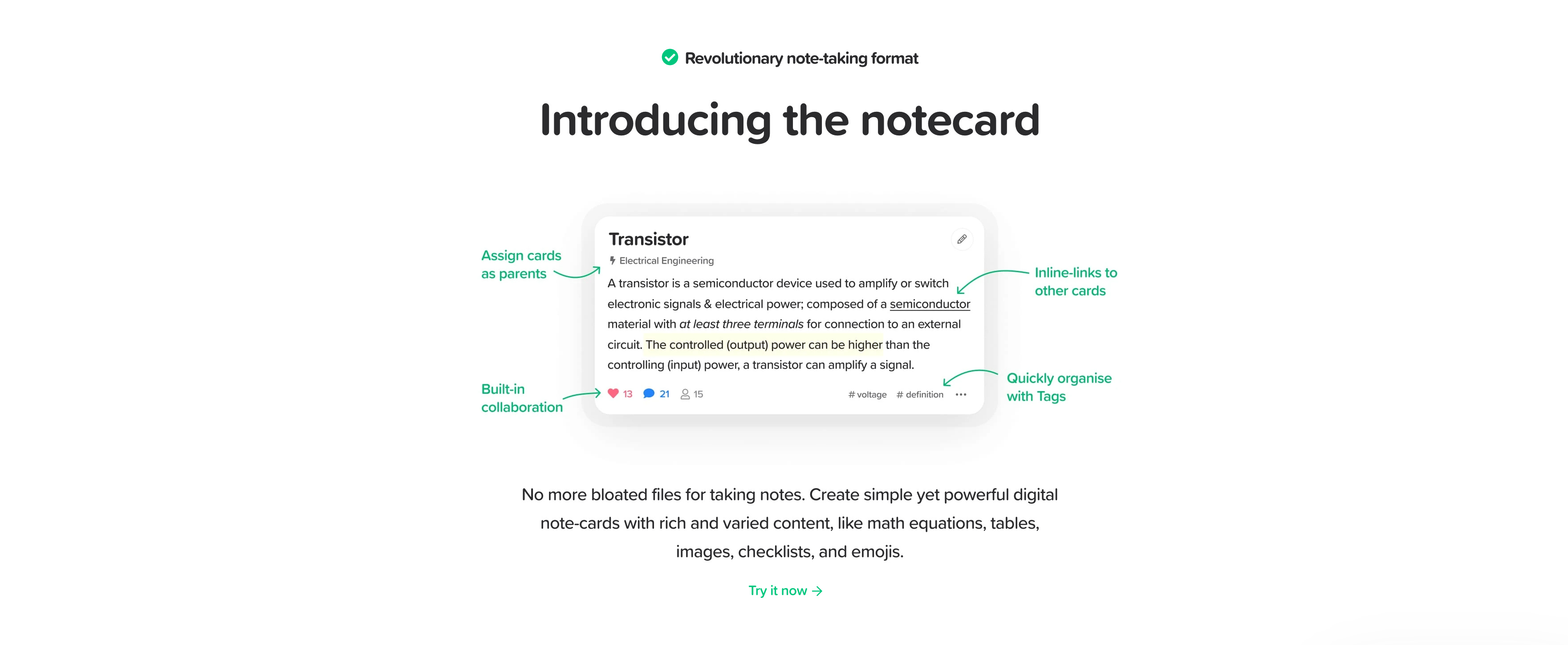
Every item (here: card) can have children and tags, which seem to be the main ways to link them.
In Formable, an item is just text. Here it has a title, description, likes, comments, more metadata, …
One can filter items, view them as a list, board, 2d / 3d graph view.
Feels like a very powerful Google Keep with the card theme.
Ok, I watched a help center video on creating hierarchy. Seems a little cumbersome to link cards. It’s a bit easier to link items in an outliner (just hitting ⏎ and tab for example). Ah, got it. When in a card it’s actually very straight forward to add a child. Linking afterwards requires a couple of actions though. Note to self that Formable is currently way worse.
A card can have multiple parents. Ace.
Supernotes seems very unique. At least I’ve seen some new things. The sharing functionality and the navigation UI are pretty smart.
I can see this card based note taking a good fit for teams. It’s similar to Mem in that regard. With like and commenting functionality on every card, this is clearly empathised.
Feel free to share this article if you found it interesting.
Thanks for reading
–Emil